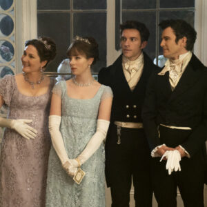
If you’ve been puzzled by some blurry backgrounds and darkened edges on your screen while watching your favorite prestige TV shows, you’re not alone. No need to check your TV settings, though: It’s intentional.
/cdn.vox-cdn.com/uploads/chorus_image/image/73263255/ShogunCinematography_Hulu_Getty_Ringer.0.jpg)
Let me describe a scenario. You’ve been looking forward to streaming the latest TV masterpiece everyone has been telling you to try. You finally find enough time to take in an hour-long episode and park yourself on the couch in front of the fancy 4K set in your living room. The screen gleams, you press play, and something looks a little … off. The top and bottom of the image seem sort of smeared. Are the edges of the frame out of focus? Did you screw something up in the settings? What’s happening here?
If any of this sounds familiar, don’t bother checking your warranty. As The Outer Limits used to say: There is nothing wrong with your television set. Do not attempt to adjust the picture. What you’re seeing is simply a hallmark of modern prestige TV. To paraphrase Norma Desmond, your screen is sharp. It’s the picture that got blurry. And that blur is by design. Welcome to TV’s era of the anamorphic lens.
It wasn’t so long ago that anamorphics—which, as we’ll explain, deserve the credit and/or blame for the medium’s loss of focus—were used mainly for movies, not TV. (“Why aren’t television shows shot with anamorphic?” asked a 2013 thread on cinematography.com.) But this newfound anamorphic phase has hit TV hard. The blurry look is all over Netflix shows, including Avatar: The Last Airbender, The Witcher, You—yes, You—Lupin, When They See Us, Encounters, and, most glaringly, Chilling Adventures of Sabrina. (And don’t sleep on Narcos: Mexico.) You may have noticed it in Homecoming, other sci-fi series such as Severance and Andor, and HBO dramas such as Perry Mason and The Gilded Age. Most of the links in this paragraph point to posts by people who watched a show and wondered why they felt like they’d had their pupils dilated.
Even if you somehow sidestepped every example of this trend until this year, you can’t ignore them now without suffering from FOMO. FX and Hulu’s Shogun is the most acclaimed show of 2024. It’s also one of the blurriest. And no, that’s not an accident. Like every other aspect of the meticulously planned and produced 10-episode miniseries, Shogun’s stylized visual language grew out of extensive consideration, conversation, and collaboration.
Early on, those three Cs involved cocreator and showrunner Justin Marks and the duo of director Jonathan van Tulleken and cinematographer Chris Ross, who would work on the first two episodes. When van Tulleken was pitching himself for the position of Shogun’s leadoff director, he put together a lookbook and mood reels that laid out his vision for the show. He took his cue from the scripts, which he says “had a texture … a strong visual voice.” On the page, Shogun “felt really bold and really like [it] had a strong point of view and a strong subjectivity.” Van Tulleken wanted to bring the same quality to the screen. And so, he says, “We started to settle on this idea of how to express this subjectivity, how to express [John] Blackthorne’s disorientation.”
While assembling the look book for Shogun, van Tulleken’s lodestars were movies that felt timeless and daring: The Godfather, Blade Runner, and, in particular, Apocalypse Now. Ross, who had teamed up with van Tulleken on previous projects dating back to Misfits, suggested several Asian influences—including Raise the Red Lantern and the work of Wong Kar-wai, Takashi Miike, and Yasujiro Ozu—as well as recent inspirations such as The Revenant and 2015’s Macbeth.
But both agree on the guiding light: Apocalypse Now, Ross says, was “a huge reference” for them. Francis Ford Coppola’s 1979 Godfather follow-up “has a point of view in its look and a point of view in its lens choice and in its framing, and it’s driven by story,” van Tulleken says, adding, “We really wanted to take some of that and create a world that was sort of intoxicating and also felt dangerous and sometimes disorienting.”
In applying that ethos to Shogun, van Tulleken and Ross adhered to the Japanese concept of wabi-sabi—essentially, that beauty and imperfection are inextricably linked and that one should seek to accept that tension. Shogun, van Tulleken says, is “a journey of acceptance,” particularly for the shipwrecked captive Blackthorne. “Everyone’s kind of a prisoner in the show, be it from culture, be it from their position in society, be it from politics, or literally a prisoner, in Blackthorne’s sense,” van Tulleken notes. The English sailor’s arc reflects “the acceptance of some of that and the acceptance of the things you can change and you can’t.”
Hence the evolution from the Blackthorne in Episode 4, who tramples on the moss in his house’s rock garden, to the Blackthorne at the end of Episode 5, who carefully smooths out the gravel surrounding a stone. Having heard Mariko’s message that “death can come for us at any moment,” and having learned the truth of that through an earthquake and the death of his gardener, he embraces the transience of beauty and life and learns to focus on the things he can control.
For the folks shooting Shogun, van Tulleken says, the challenge posed by wabi-sabi became “How do we take this very perfect thing in the digital cameras we use and also in these beautiful, austere sets and these incredible, rich costumes, and how do we break it so we’re not fetishizing it, we’re not turning it into a fantasy?”
Their answer: anamorphic lenses.
Anamorphic lenses were developed a century or so ago as a means of obtaining a wide-screen image from film and camera equipment with a non-wide-screen aspect ratio. (The lenses themselves horizontally squeeze the image, which is then stretched upon projection.) Compared to standard, spherical lenses, oval anamorphics enable a wider field of view, used in movie formats such as CinemaScope, which arose in the 1950s in response to the threat TV posed to the box office. Anamorphic lenses can capture the full sweep of stunning landscapes instead of lopping off a large part of the picture, but—for better or worse—in close-ups of characters, their shallow depth of field creates a stark contrast between the in-focus subject(s) at the center of the frame and the blurred background around them.
The anamorphic look came to be seen as “cinematic,” but the lenses fell out of favor in the 1990s thanks to the development of formats such as Super 35, which made up for some of the shortcomings of spherical lenses vis-à-vis anamorphics by offering additional horizontal film area. Not only did those newer spherical alternatives capture more of the upsides of anamorphic lenses, but they were also free of the downsides—the image artifacts and distortions that result from anamorphic compression and stretching: namely, elongated lens flare (see the prominent examples in the Playboy Bunny and Do Lung Bridge sequences of Apocalypse Now), an impressionistic, swirly bokeh (background blur), and obvious vignetting (darkened corners of the frame).
Assuming you see those as downsides, that is. In the digital era, van Tulleken says, cameras can be “very clean,” “pitiless,” and “ruthless.” That’s perfect for some projects—say, sports broadcasts—but with others, he says, “you’re trying to break that up” in order to “put an organic feel into that very digital realm.” In other words, wabi-sabi. Couple that desire with the enhanced light sensitivity of digital equipment, which has made it easier to meet the elevated lighting requirements of anamorphic lenses, and you have a recipe for a resurgence.
This impulse isn’t unique to Shogun’s creative team. The cinematographer Neil Oseman says that “ever since cinematography went mostly digital, filmmakers have looked for ways to undercut the clean precision of the images with some unpredictable characteristics. Introducing distortions, lens flares, [and] bowing in the horizontal lines, as many anamorphics do, is one way for cinematographers to achieve that.” Oseman, who blogged about the rise of anamorphic lenses on TV in 2020, says their use “has increased over the last five or 10 years” not only out of a desire for a more cinematic feel, but because “TV networks and streamers allow wider aspect ratios than they used to, so anamorphic lenses are an option where they weren’t before.” (Until about 20 years ago, most TVs weren’t wide-screen.) Anamorphic lenses are more expensive than spherical, but as Oseman notes, “TV budgets are high enough now for these expensive optics to be hired.”
Shogun’s budget was plenty big enough for the production to pair its Sony Venice cameras with Hawk V-Lite and class-X anamorphic lenses, whose bokeh boasts a “really interesting swirl,” according to van Tulleken. (V-Lites were used on the British crime drama Top Boy, an early small-screen anamorphic adopter that van Tulleken and Ross worked on.) As Shogun begins, Blackthorne arrives in a land that seems strange and somewhat barbaric to him. The Englishman seems just as strange and barbaric to those he meets. To capture that mutual alienation, the filmmakers leaned into their tools’ distortive effects. The aperture of a lens controls how open it is; the wider the aperture, the more light it lets in, and the more noticeable the bokeh. Early on, van Tulleken says, “We were wide open a lot on the [lenses] so that we could really have a natural, strong focus falloff behind our characters.”
See, for instance, Blackthorne’s wraithlike crewmates in the premiere:
:no_upscale()/cdn.vox-cdn.com/uploads/chorus_asset/file/25378462/Blackthorne1.png)
Or a couple of Blackthorne’s captors looming behind him, before he breaks down the language barrier:
:no_upscale()/cdn.vox-cdn.com/uploads/chorus_asset/file/25378460/Blackthorne2.png)
Some shots show basic barrel distortion. Others evince an even more exaggerated fish-eye effect. And then there’s the vignetting, which van Tulleken and Co. opted not to crop out in postproduction. “In some places, to show that Blackthorne alienation and that disorientation, we actually left those in,” the director says.
:no_upscale()/cdn.vox-cdn.com/uploads/chorus_asset/file/25378458/Blackthorne3.png)
These choices suited the aesthetic the creators were crafting. Following the leads of Apocalypse Now, Macbeth, and The Revenant, Ross says, “We wanted to be more visceral and more first-person, wanted to put the audience in the protagonists’ shoes. So that led us to think that we would be jumping into their sphere of influence, within 3 feet of the characters’ space.” The background blur encourages the viewer to, well, focus on the foreground characters.
In theory, these anamorphic artifacts can convey character dynamics, too. In some scenes, van Tulleken says, “There was almost a wrestle for who was in control of them, whose scene it was.” Accentuating or masking anamorphic effects depending on the scene or the speaker was one way to “play with those shifting sands of power within a scene, and who thinks they have it and who doesn’t.” Ross adds, “Every scene has a surface story, a surface plot, but at the same time … deep levels of character development and then, in hindsight, some form of revelation, because of betrayal or whatever.” Rewatching Shogun with that hindsight and dissecting it on a shot-by-shot level might produce epiphanies about why certain scenes were framed the way they were.
This all seems somewhat adventurous, stylistically, for a series FX was making a big bet on. Were there any network notes?
“There was nervousness,” Ross says. “There’s nervousness about everything, which is totally understandable. It’s huge sums of money to spend and an enormous leap into the unknown.” Ultimately, though, “Everyone was super supportive of this idea.” Van Tulleken acknowledges that “different streamers have a different appetite for boldness,” but at FX, he says, “No one ever said, ‘Ah, I think this thing is too much.’ … It was always a sense of: How can we push the show? How can we live up to the ambition of the show? … It was an astoundingly supportive environment to make something in.”
The internet, naturally, is not always so supportive. Shogun, on the whole, has been rapturously received by critics and the public alike. The unorthodox cinematography, specifically, has drawn some measure of praise but also some consternation, judging by various Reddit posts and comments. Some spectators seem to have been alienated (or just plain confused) by Shogun’s visual depiction of its characters’ alienation.
The anamorphic backlash to Shogun and its ilk could be akin to two common complaints about TV: Shows are too hard to hear, and shows are too dark to see. Each of those gripes stems in part from the fact that the conditions under which TV is created differ from the conditions under which it’s consumed. In this case, it’s not that viewers lack the high-end speakers or screens to render a director’s vision faithfully; it might be that the audience lacks the visual vocabulary to grok what the auteur intended. Perhaps this fancy stuff slays with cinephiles, but it leaves the average viewer cold.
One of the problems with Hollywood today is that all the movie editors are now using HDR screens with 1000 nits brightness, and they don’t realize that they are making every movie and TV show way too dark to see.
Take this example… how the f… will you be able to watch this? pic.twitter.com/BLRJB1FaB5
— Thomas Baekdal (@baekdal) April 6, 2024
Van Tulleken is not the kind of creator who claims not to read the comments. “I’ve read all the Reddit,” he admits. And he’s thought a lot about the balance between challenging and distracting viewers.
“You just have to go where you feel the visuals tell you to go,” he says. On Shogun, these decisions were “led by the story” and “came from a very, very well-thought-out philosophy. … And I think if you’re trying to go out there and make something interesting and make something that captures people’s attention, it is impossible to please everyone.” Every viewer “has the right to their point of view,” van Tulleken continues, but “there’s a world where we make the clean show and you shoot it very clinically, and you wouldn’t get the praise.”
Nor would a director like van Tulleken feel fulfilled if he shied away from following his anamorphic muse. “Anything, frankly, that makes people sit up and lean forward and pay attention to their screen, I’m all in favor of,” he says. In his view, it’s better to conduct an experiment that might make some viewers annoyed than to hew so closely to convention that no one feels anything. “Sometimes on set, you feel a little scared doing something, and you don’t know whether that’s failing or succeeding,” van Tulleken says. “But I’m always quite a fan of that feeling of going, ‘God, I don’t know.’ I think it’s better to feel a little bit scared when you’re trying to make some art than the reverse of feeling like, ‘Ah, I know this will work because I’ve seen it a million times.’”
Ross’s sentiments are similar. “Sometimes some people won’t agree with you and they don’t like the aesthetic,” he says. “But if you try to create an aesthetic that everybody loved, then you’d effectively create the image equivalent of Walmart. And although it’s a great shop where you can buy everything you need, you don’t get your bespoke suit from Walmart, you get it from Jermyn Street. You’ve got to fight the fight you feel you need to win in order to create the aesthetic that all of you believe in so strongly.”
Darcy Touhey, a director, producer, and camera assistant who worked as a film loader on Shogun, responded to some Redditors to defend the visuals from accusations of sloppiness—though he does share some viewers’ reservations. Via private message, he says, “It is 100 percent supposed to look like this. It’s incredibly intentional and had to go through a lot of channels in [preproduction] to get approved. So people thinking it’s a mistake are just wrong. Artistically, you could say maybe it’s a mistake. Practically? Absolutely not. … We had like 10-14 monitors at any given time on set. Everyone was seeing what the audience is seeing.”
Lens-wise, however, he has some notes. “I don’t necessarily agree with the decision,” he says. “I think the breathing and the vignetting is very distracting. … Those lenses just looked better when slightly longer, in my opinion.” Touhey believes that on some series, filmmakers may be shooting wide open more than they need to and under-lighting due to digital dependency and inexperience with vintage glass. Van Tulleken confirms that to make anamorphic magic, “You need a great crew, you need a great cinematographer, you need people who really understand those lenses. … You need a great focus-puller. You need a great [camera assistant]. The lenses break, they fall apart. … I don’t think it’s for the casual hand.”
But Touhey also asserts that “people are focused on the lenses way too much when considering the cinematography of [Shogun]. The cinematography shines in this show because of the intense commitment from every department towards realism and authenticity. The sets, both studio and location, were unbelievable. The attention to detail was astounding. … A good show looks good because of every aspect of production.”
Like Blackthorne, Mariko, and most other Shogun characters, I’m torn between competing preferences and loyalties. On the one hand, I admire the audacity and distinctiveness of Shogun’s visuals and the care that clearly went into them. On the other hand, I do find the heavy anamorphic effects distracting, in the sense that some part of my brain fixates on the fluctuations in focus, possibly at the expense of some immersion in the show. (This tendency is probably exacerbated by Shogun’s reliance on subtitles: The text draws the eye to—and, in my mind, kind of clashes with—an often out-of-focus segment of the screen.) Also: I want to see those costumes, sets, and scenery! There are ways to make a series’ cinematography stand out without making some subset of the audience want to pound the tops of their TVs, Fonzie style.
:no_upscale()/cdn.vox-cdn.com/uploads/chorus_asset/file/25378461/Blackthorne4.png)
I’m most amenable to the out-of-focus, swirly look when it serves the story, as it does on Shogun. The Gilded Age uses anamorphic effects to draw a distinction between the milieus of “old” New York and “new” New York. Severance does the same to separate the characters’ “severed” lives at Lumon Industries from their outside existence. Homecoming used anamorphics to underline the off-balance nature of the narrative.
Not every series seems to have such clear reasons for straying from TV tradition. Even on streaming series less thoughtful than Shogun, though, directors don’t end up with anamorphic effects by accident. “I think it’s always very considered and deliberate,” Touhey says. “Shows in those budget ranges are doing camera tests well before shooting. They are doing lens projection, etc., to make sure everything is working as intended.” Some series are steering away from sterility; others are pursuing a “cinematic” signifier. “People want TV to be more like cinema now,” Touhey says, “so the use of anamorphic is becoming more prevalent because people associate that with cinema. … I wouldn’t agree again that it’s best for the medium, but it is an easy way to visually say, ‘This TV is more like a movie than TV.’”
In effect, television has adopted a technique that moviemakers pioneered to differentiate film from TV. One wonders whether the anamorphic lens’s association with cinema will last now that this look is becoming ubiquitous on TV. “Part of my job is to make sure that we’re trying to do things that are not just being repeated everywhere,” van Tulleken says. “I’m always taking note of the cinematographers and what is being done in the space and who is making bold directorial decisions. And you’re always [hoping] you’re not aping and [that you’re] progressing the medium.”
The good news is that the more familiar anamorphic effects are, the less off-putting they’ll be. For directors who want to reset the status quo, though, that’s also the bad news. At this rate, a sharp, pristine picture might go back to being the bolder choice. Alternatively, directors could keep cranking the anamorphic meter higher to top previous stunts.
“Arguably, Netflix’s Chilling Adventures of Sabrina took it too far,” Oseman says. “They used Panavision Ultra [Speed Golds] anamorphics for scenes involving magic, which put a Salvador Dalí–esque blur on the sides of the frame. I thought it was a daring choice, but it was very noticeable, and I know it took some viewers out of the story.”
Perhaps that’s happened in Shogun at times, too. Then again, the slight discomfort and disorientation I’ve felt while watching Shogun are what its creators intended. Maybe it’s made me identify with the characters and enriched the experience in ways of which I’m not completely conscious. It’s tough to say: We can’t compare the Shogun we got to a version of the show that’s the same except for flawless footage shot with spherical lenses. What we can say is that the Shogun we got is good. And if the blur bothers some viewers, it can’t be a big impediment: Whether partly because of or partly in spite of the lens selection, people are watching (and largely loving) the show.
If your reaction to the initial lens look was closer to tolerance than love, you’ve probably been relieved to see those effects fade across the season. That, too, was part of the plan. The choices van Tulleken, Ross, and Marks made early on “set up a sandbox that everyone could then play in,” van Tulleken says; inside that structure, subsequent cinematographers and directors have had a lot of freedom to do their own thing. As van Tulleken concludes, “This show has an evolution, it has an arc, and I really believe in the grammar of shots, that they should show the escalating arc of a scene and of a story and a series. … We kept the same anamorphic lenses, we kept the same cameras, but not every scene needed what we were doing.” As Blackthorne learns the language and the lay of the land in later episodes, the disorientation is dialed down.
If you or someone you love is still struggling with the symptoms of TV’s anamorphic phase, at least you know now that you haven’t been hallucinating. Focus (so to speak) on the positive, and practice the eightfold fence. Maybe you’ll suddenly see the wisdom in this wabi-sabi of the screen. And if you still want to break up with blurry shows, don’t feel bad about it. It’s not you, it’s TV.
